Case studyFXCMFinance
Before redesigning FXCM’s front door, we clarified who it was for
FXCM brought me in to fix a bounce problem across its marketing site. We diagnosed the site before redesigning it, clarified which two audiences it needed to serve, and aligned the information architecture, editorial, and design around them. Account conversion rose 1.5x, and FXCM cloned the approach across its international sites.
- Client
- FXCM, retail forex trading platform
- My role
- Design consultant, dotmatrix studios
- When
- 2012, about four months
- Sponsor
- AJ Mihalic, Global Director of SEO
- Worked with
- FXCM marketing, editorial, and visual design
Results
After the redesign
- 1.5xaccount conversion overall, and 3x from search traffic
- +20%demo sign-ups overall, and +42% from organic search
- −20%bounce rate across the site
Reported by AJ Mihalic, FXCM Global Director of SEO. FXCM later cloned the approach across its international domains.
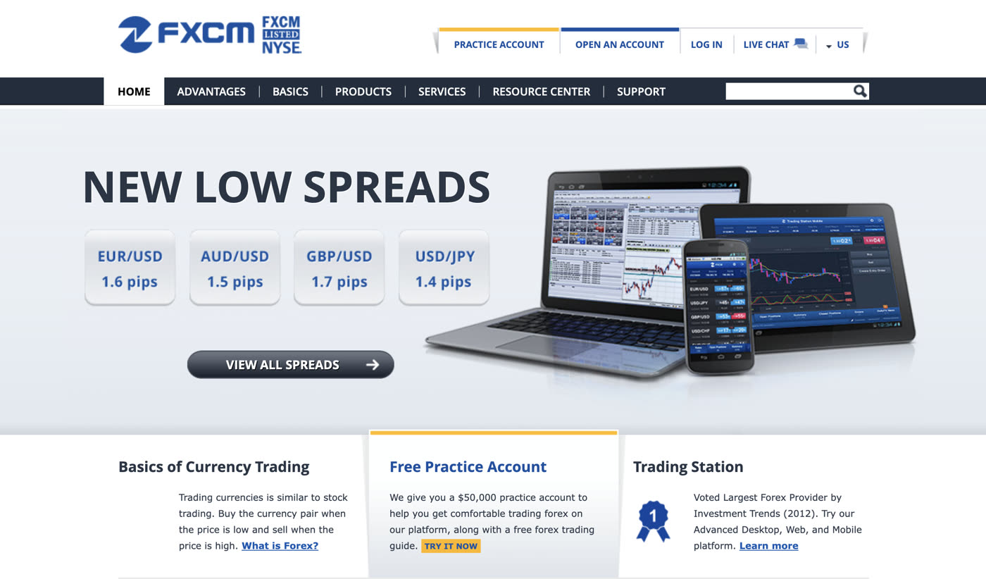
The brief
FXCM, a retail forex trading platform, hired my studio to fix a bounce problem across its marketing site. The site’s one job was to turn visitors into practice or live trading accounts. The homepage was the worst of it, losing about 70% of visitors; unique inbound traffic was low, and people who started a sign-up often abandoned it.
Usability was a mess, and the bounce rate was a symptom. The site spoke to every visitor and to none in particular. Navigation was deep and inconsistently labeled, calls to action competed with each other, and each new content addition made things harder to find.

Who owned what
As an outside consultant, I owned the thinking, not the teams that would carry it out. Every change depended on people inside FXCM choosing to act:
- My studioDiagnosis, personas, information architecture, wireframes, and specifications
- Global Director of SEOMy sponsor, and the only path to FXCM’s executives, budget, and time
- Marketing leadershipApprovals, and the market research the personas would come from
- EditorialThe content calendar, with no plans to change the site
- FXCM’s visual designerThe final interface, built from my wireframes
What I did
Without authority over FXCM’s teams, my leverage was evidence, a sponsor, and a shared picture of the customer. My strategy was to turn a metric into a problem everyone could see, put the case in my sponsor’s hands, and give every team the same answer to one question: who is this site for?
In practice, that meant:
- Make the problem measurable. Score the whole site before proposing a redesign, so the scope came from evidence rather than my opinion.
- Equip the sponsor to sell it. Give the person with access to executives a strategy he could defend as his own.
- Give every team one picture of the audience. Define who the site served, then let architecture, editorial, and design all build toward the same people.
The engagement ran about four months, in two phases.
Phase one
Diagnose and align
The first weeks: turn the brief into a scored problem, expand the scope through the sponsor, and settle who the site was for.
Diagnose before redesigning
Even a cursory review showed the causes weren’t confined to the homepage. The whole site needed a simpler palette, more intentional organization, and more precise content. Redesigning on that impression alone would have meant asking FXCM to fund a hunch. Instead I recommended a short discovery phase: a heuristic evaluation of the entire experience, so FXCM’s marketing leaders and I could agree on next steps from evidence.
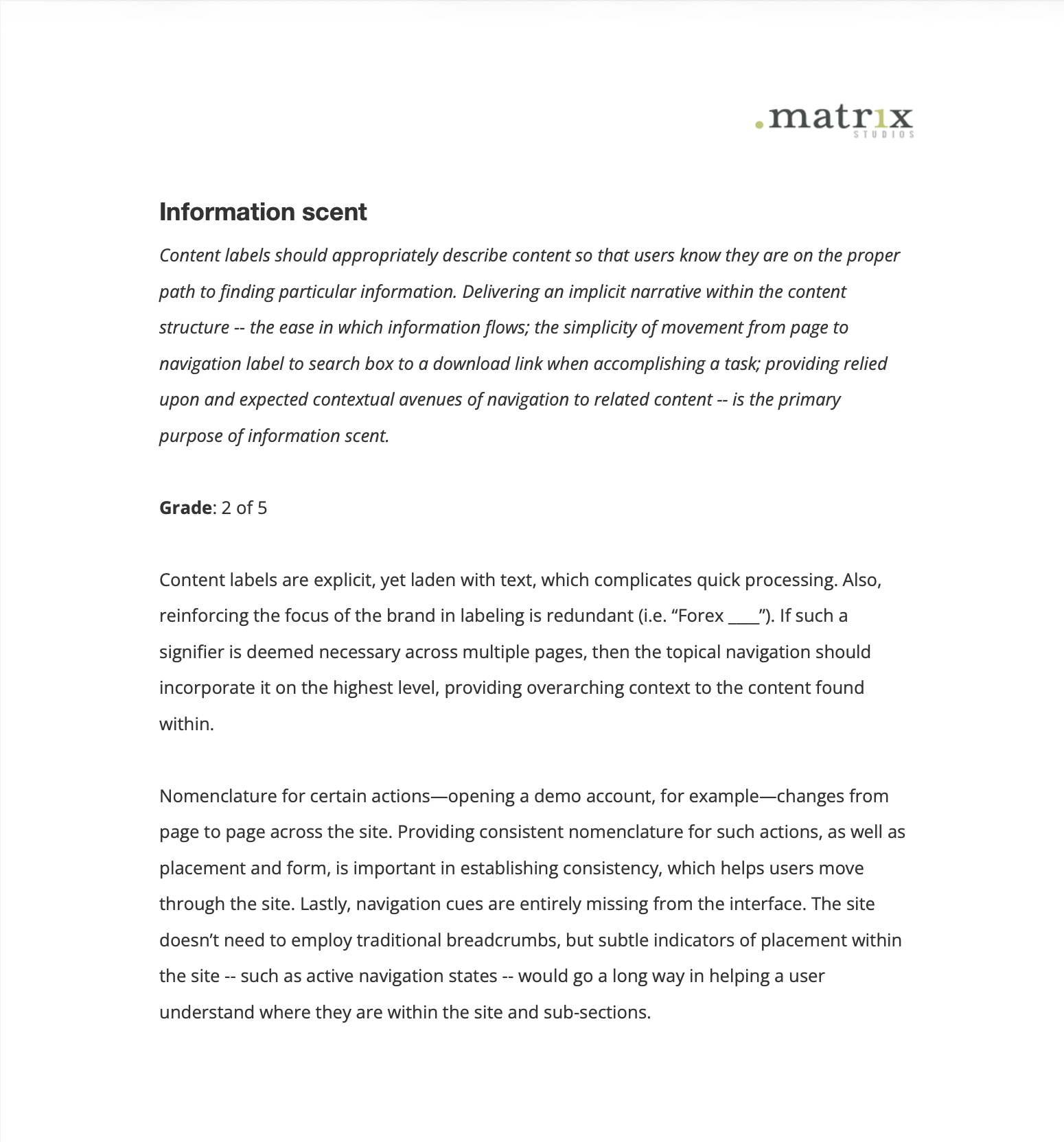
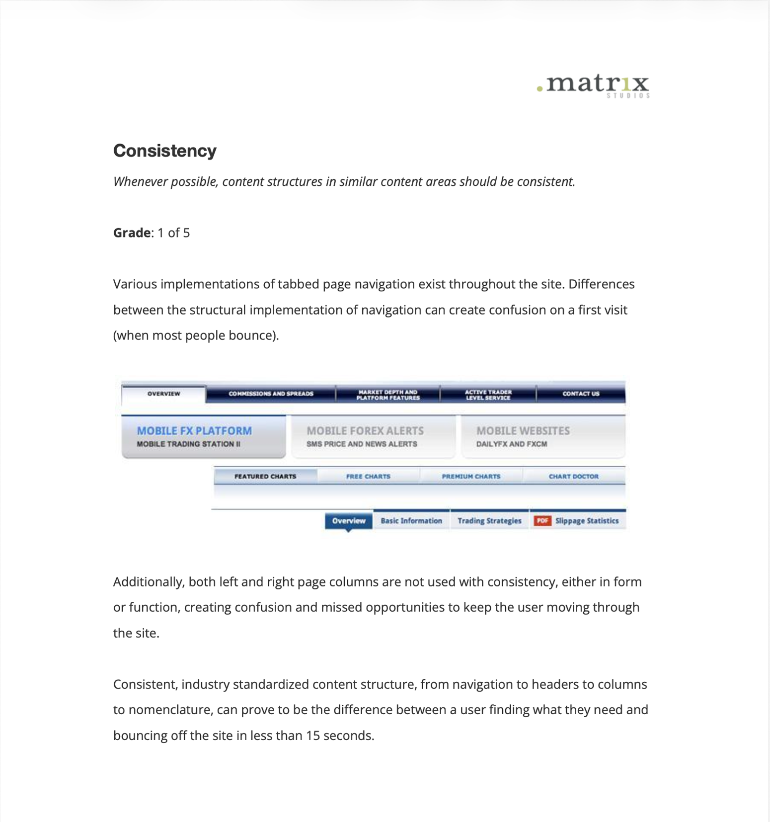
Over a few weeks I scored every section on information architecture, interface design, and content heuristics. The average was 2.3 out of 5. I recommended the redesign focus on six issues:
- Prioritize content based on primary persona expectations and needs
- Reorganize and rewrite the navigation to be shallow, narrow, and understandable
- Be consistent with the language, form, and function of all UI elements
- Increase signal through information hierarchy, in particular with essential CTAs
- Invest in making users’ lives easier
- Provide both contextual and destination help
I didn’t take the findings to FXCM’s executives. I took them, with a strategy for moving forward, to AJ Mihalic, the Global Director of SEO and my primary stakeholder. Once he bought in, he made the case to the executives himself and came back with more budget and more time.
The scope grew from fixing a bounce rate to re-architecting the site, specifying a first-visit onboarding experience, and outlining a content strategy.
Clarify who the site was for
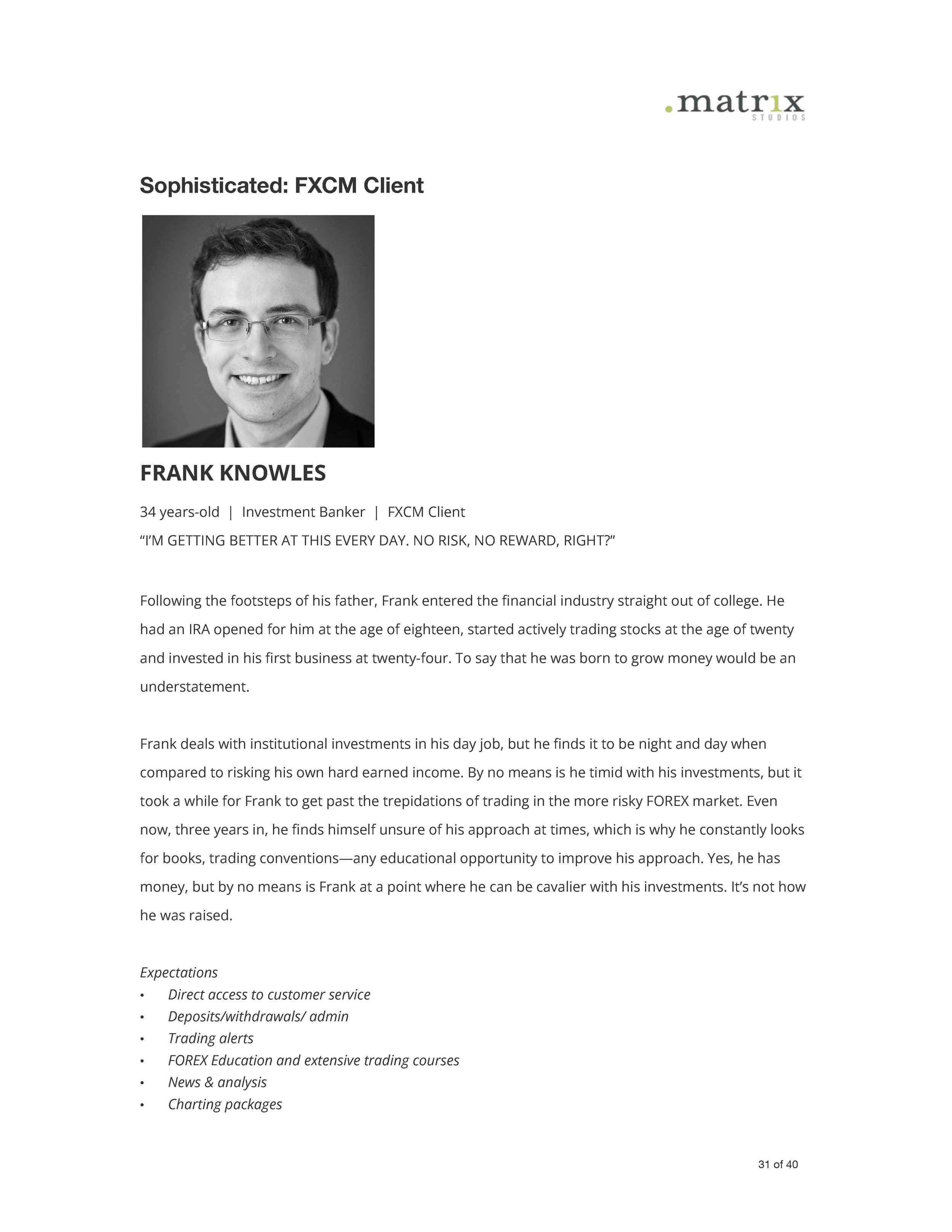
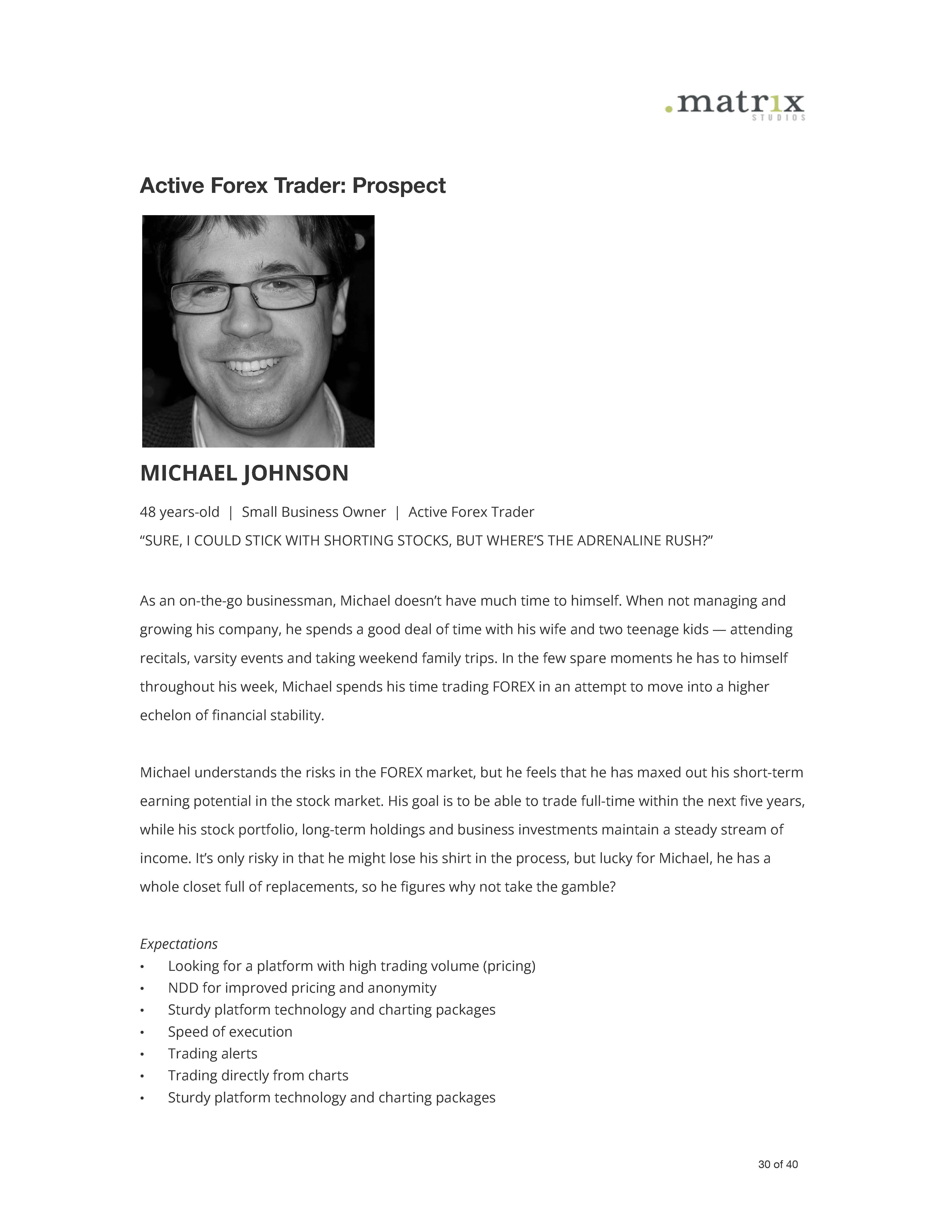
The evaluation showed a site trying to speak to everyone, so the next step was to clarify who it was actually for. There was no budget to interview prospects or clients, but FXCM’s marketing team had market profiles built from surveys and focus groups with both. I worked through them with AJ and the marketing team around two questions: who visits the site today, and which market is most valuable to attract. From that I drafted stake-in-the-ground personas, synthesizing FXCM’s research into people with representative expectations.
In our age of rapidly shipping product and design by quantitative patterns, people tend to overlook personas. If archetypes are derived from investigations into the motivational, behavioral, and aspirational patterns of the market, I find personas to be invaluable, even if the artifact only serves as a tool to drive alignment across teams.
Two audiences mattered most: experienced forex traders who didn’t know FXCM, and stock traders curious about forex. They became the site’s two main content areas, Advantages and Basics. Editorial, which had no plans to touch the site, started planning articles on its content calendar against each persona’s expectations.
Phase two
Architect and hand off
The rest of the engagement: build the structure around the two audiences, and specify it so FXCM’s own teams could carry it.
Rebuild the architecture around two audiences
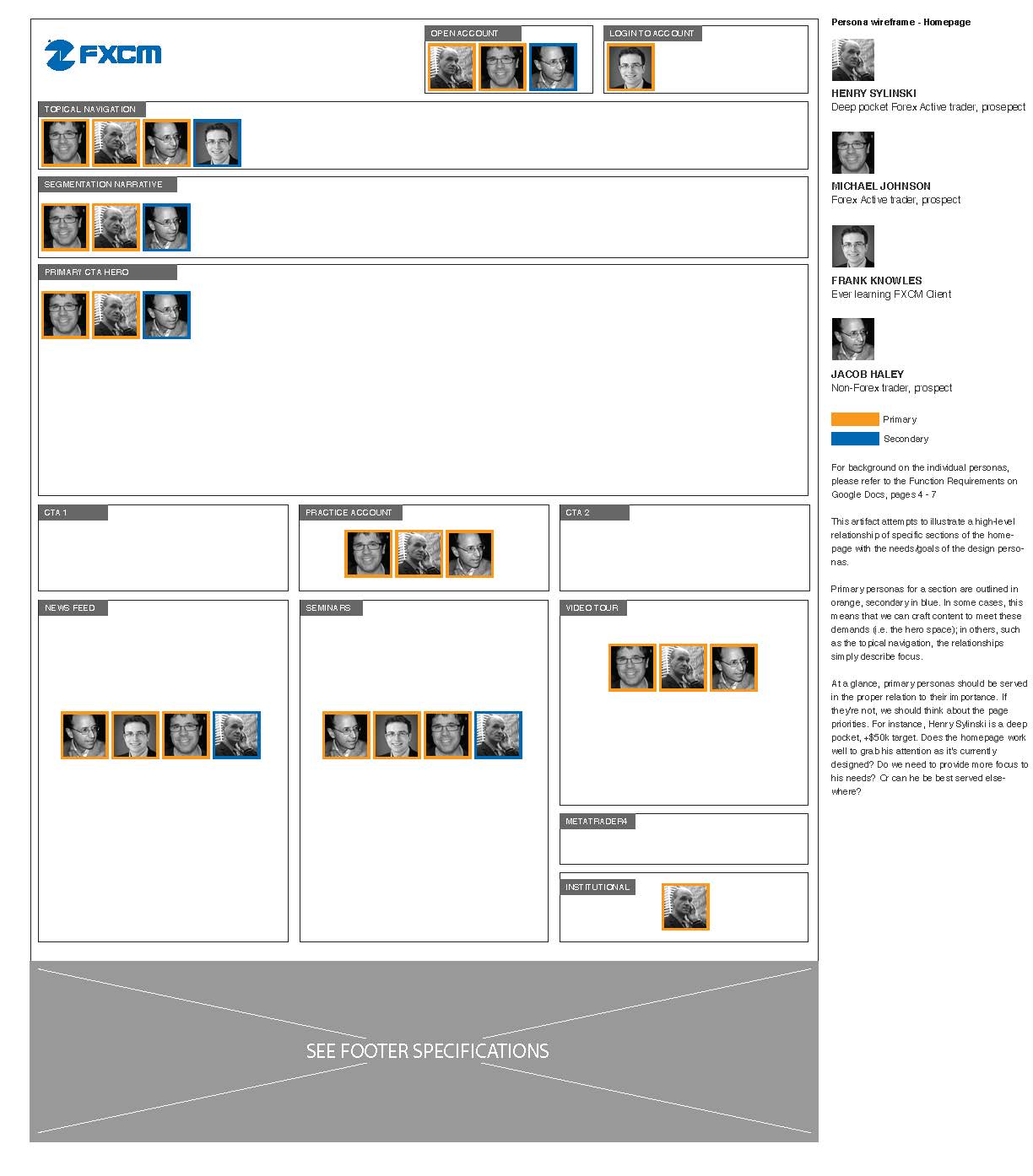
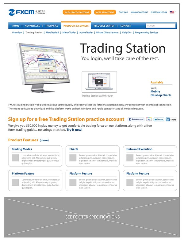
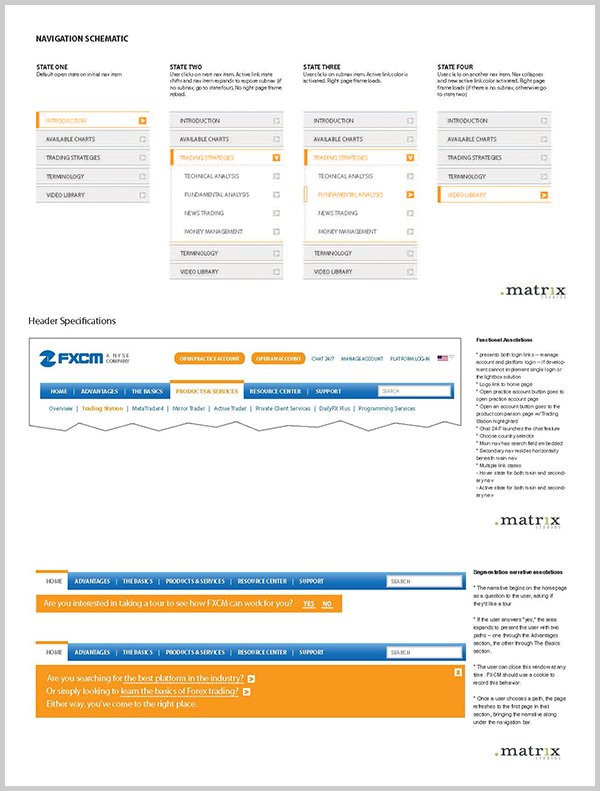
With AJ aligned on the strategy, I moved into the information architecture, from the taxonomy down to page hierarchy and individual widgets. A large share of paid keyword traffic landed on the homepage, so I started there and worked outward through the key sections. I simplified the topical navigation and set four goals for the homepage: clear paths for prospects, a permanent sign-up call to action in the header, a first-visit onboarding experience for traders new to the platform, and a hero area for events, seminars, and educational video.
I presented the homepage as a sketch, with each section marked by the personas it served. Marketing leadership agreed quickly, and that sketch carried the wireframes for every key template.
Make the practice account the one next step
Every page needed one clear next step, and I made it the practice account. The header and the content-page rail kept the same paths in the same places across the site. In the wireframes I gave the practice account call to action a single contrasting color, so FXCM’s visual designer knew it had to outrank everything else on the page. We also described the practice account above the fold on the homepage, so prospects didn’t have to leave to find out what they were signing up for.
Then the sign-up itself: a multi-step wizard became a few fields in the content rail. The hypothesis was that a lighter sign-up would cut bounces and lift conversion.
What I handed over was meant to outlast the engagement: wireframes and specifications for every key template, the first-visit onboarding experience, a content strategy outline, and personas editorial could keep writing against. FXCM’s teams built from them, and after launch FXCM cloned the approach across its international sites.
In their words
“I doubt there are many user experience and interface designers who produce like Sean. He has experience and a track record that will impress anyone, and with that experience he’s refined an iterative process that is thorough, creative, and open to feedback all at once. Sean is able to quickly distill client needs from disparate feedback and convey that in the resulting design iterations. The result is innovative, clean, minimalistic design tied seamlessly to business and user requirements. Sean’s flexibility and calm demeanor also make him easy to work with in any situation. Any time I have a need for a UX, IA, or design consultant, Sean is the top choice for me.”
Key learnings
- A diagnosis is a negotiating instrument.The heuristic evaluation turned a metric problem into a structural one, and it put the case in terms FXCM could fund. It also gave editorial a reason to act. A redesign proposal alone wouldn’t have done either, which is why I now treat discovery as part of how the work gets bought, not a phase before it.
- Design the argument for the person who will carry it.I didn’t make the case to FXCM’s executives; AJ did. My job was to give him a strategy he could defend as his own. That shift, from presenting work to equipping a sponsor, is what expanded the budget and the timeline.
- Proxy research is a starting position, not a finding.Personas built from FXCM’s market profiles aligned marketing, editorial, and design quickly. Every downstream decision inherited their assumptions, though. Given the chance again, I’d test them with a handful of real prospects before the architecture was locked.
- Friction concentrates at the point of commitment.Structure and content earn the visit; the sign-up decides whether it converts. Collapsing a multi-step wizard into a few fields in the rail treated the form as part of the architecture, not a detail to resolve at the end. I now design that moment alongside the IA instead of after it.
- Attribution has to be designed, not inferred.The results came back as one set of numbers for UX, IA, and SEO together. That was enough to call the project a success, but not to isolate what the design changed. Agreeing on separate measures before launch is how design earns its share of the next budget conversation.
Questions about this project? Email me.