Case studyAmeritradeFinance
Unifying two trading platforms around the active trader
I joined Datek Online as an interaction designer months before Ameritrade acquired it, and I stayed. With two trading platforms serving two very different kinds of clients, I was part of the small team that pitched leadership on a single new platform built for a segment neither served well: active traders. Promoted to Ameritrade’s first UX Design Manager, I built a team of thirteen, brought Goal-Directed Design into the company, and led design of Apex, the platform Barron’s credited as Ameritrade rose to second place in its online broker review.
- Company
- Datek Online, then Ameritrade after it acquired Datek
- My role
- Interaction designer, then Ameritrade’s first UX Design Manager
- When
- 2002 to 2005
- Team
- Nine hires, plus four front-end engineers
- Reported to
- Director of Engineering, then Larry Szczech in the business
Results
The work
- 2ndplace in Barron’s 2005 online broker review, up from 12th the year before
- 4★from Barron’s for Apex, up from 2.5 stars for Ameritrade’s legacy site the year before
- 13designers, writers, and front-end engineers on Ameritrade’s first UX team
This was before behavioral analytics. Conversions, unique visitors, and traffic weren’t readily available, so Barron’s review was how the industry and Ameritrade’s leadership judged a platform.
A few months after the review, Ameritrade and TD Waterhouse U.S.A. announced they would combine as TD Ameritrade. That deal was about accounts and assets, and it would have happened regardless of our work. But Apex gave the combined company a unified, polished client experience to grow on.
The service
Ameritrade served everyday investors, and Datek Online, which it acquired in 2002, served active and day traders. Apex was the platform that brought the two together. I pitched it to Ameritrade’s leadership with two colleagues, and then my team and I spent a year designing and building it. This TV spot, produced by Ameritrade, featured SnapTicket, the always-available trade ticket we designed for Apex.
The bet
In 2002, practically every exchange of data between people and websites relied on form submissions and page refreshes. Datek’s Streamer broke ground by delivering asynchronous, real-time market data to the public, something previously available only to professional day traders.
I joined Datek as an interaction designer on the Streamer Suite. Only months later, just as we released Command Center, the first app I led design for, Ameritrade acquired Datek, and Command Center became a featured product in the acquisition discussions. The deal worried day-trading communities. Datek had innovated for its clients, while Ameritrade served less savvy, more conservative investors and was, at best, cautious with its offerings.
Many of Datek’s talented people left. I stayed. I saw a chance to help shape what the combined company would become, and I chose to invest in learning how to lead there.
After months of maintaining two brands and two platforms, Tom Alison, Dan Saffer, and I, with the blessing of Larry Szczech, Datek’s SVP of Strategy, flew to Omaha to pitch Ameritrade’s leadership on a new trading platform. We also named an underserved segment between the two existing investor archetypes: the active trader, someone who makes 10 to 20 trades a month. Day traders brought in more commission per client, but Larry and our director of strategy hypothesized that active traders dwarfed them as a market.
Leadership agreed. We needed a platform built for active traders that still supported the scenarios of day traders and long-term investors: improved trading features, a new visual language, and a new interaction model, under a new brand.
The system
For an active trader, the platform was a loop they ran many times a month:
- ResearchQuotes, watchlists, news, and research, wherever the trader chose to look
- TradeEnter an order quickly and correctly, whatever its type
- ConfirmKnow the order was received, and see it in context
- ManageChange, cancel, or replace open orders before they fill
The work carried six constraints:
- Two client basesDatek’s day traders and Ameritrade’s long-term investors relied on different features
- Two platformsThe brands differed in promise, visual language, interaction model, and trading features
- Prices moveIn a time-sensitive market, every error loop or extra page cost the trader money
- The browser of 2004Out-of-the-box front-end frameworks couldn’t easily show live, changing data
- RegulationTrading features carried detailed regulatory requirements
- Design had no seatAmeritrade spoke finance, and design sat at the bottom of the development organization
What I did
No one at Ameritrade had ever designed a platform around the needs of specific clients. My strategy was to give everyone the same picture of the client, then let the details of the work prove what that picture was worth.
In practice, that meant:
- Build the team the platform needed. Hire specialists, and give design a working place inside engineering.
- Bring Goal-Directed Design into the firm. Teach the wider team to design from client goals, not feature lists.
- Sweat the trading loop. Keep the ticket one click away, prevent errors, and confirm every order.
- Put the work in front of the industry’s judge. Take Apex to the reviewer whose rating the market trusted.
The first two became phase one; the rest became phase two.
Phase one
Lay the foundation
Ameritrade’s first UX team, and one language for the client across everyone who touched the platform.
Build the team the platform needed
With the green light, I was promoted from interaction designer to Ameritrade’s first UX design manager. My charge was to scale a team that could cover three products at once: Streamer, the real-time trading suite; Amerivest, a retirement investing service that built a portfolio plan from a client’s needs, risk tolerance, and retirement horizon; and the new unified platform, later branded Apex.
There was no design organization to inherit. Within six months I had hired nine specialists and taken our front-end engineers under my wing, for a team of thirteen: four interaction designers, two interface designers, two writers, an information architect, and four front-end engineers. I hired specialists because trading interfaces were dense with rules, edge cases, and regulatory language, and each role covered ground the others couldn’t.
- 4Interaction designersModeled persona needs, flows, states, task logic, and screen wireframes
- 2Interface designersDesigned interface components and the visual language
- 2WritersMade financial content clear and managed compliance for site updates
- 1Information architectOrganized both platforms into one structure
- 4Front-end engineersMade live data work in the browser
The team also needed a place in how work got done. This was before product management as we know it. Design reported to a director of engineering, and requirements came from business analysts. So I worked interaction design into the analysts’ requirement gathering, had my designers iterate side by side with front-end engineering, and used task flows to bring back-end engineers into conversations about system design. We were one of the first UX design teams in the financial industry, working with colleagues across three states. Over time, I moved design out of engineering to report into the business, under Larry Szczech.
Bring Goal-Directed Design into the firm
Requirements arrived as lists of features and business rules, and the two legacy platforms showed it. A team of thirteen couldn’t change that alone. Engineers, analysts, and stakeholders needed to see clients the same way we did.
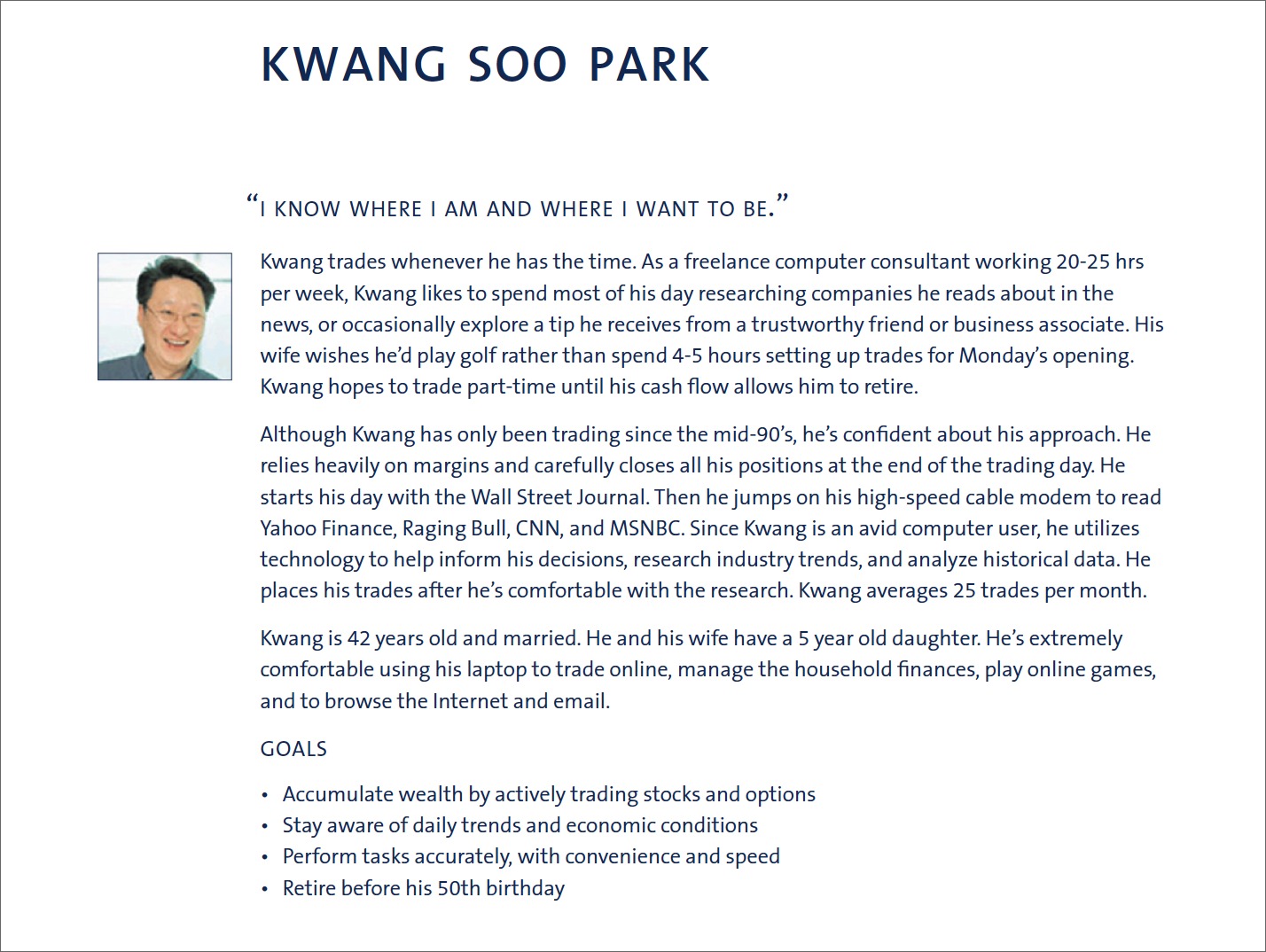
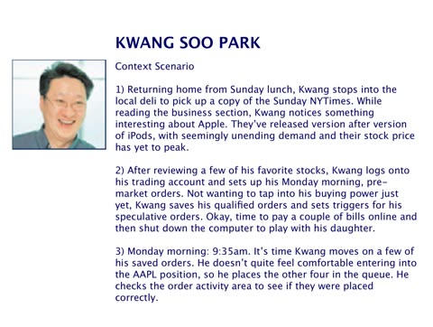
I chose Goal-Directed Design, the method developed at Cooper, because it starts where Ameritrade’s requirements didn’t: with research into who the clients are and what they’re trying to achieve, modeled as personas, then played out as context scenarios before anyone defines requirements or draws screens. I brought in David Fore, a VP at Cooper, to run a workshop for my team, our business analysts, and our engineering partners, and invited stakeholders to sit in alongside them.
“I have met few people who can equal Sean’s craft, professionalism, and passion. The work he directed during my collaboration with him was as complex at a domain level as it was at an organizational level. It was impressive to watch him oversee a two-fold innovation program that included dozens of staff and executives: he orchestrated a workshopping process where participants learned human-centered innovation methods and he had the team apply this knowledge to the redesign and re-development of key parts of the company’s flagship offering.”
Then we applied the method to Apex. We ran a formal summative usability study in a usability lab in New York to understand the pain points of both client bases, and qualitative interviews to surface their aspirations, and both shaped our personas. The business analysts kept identifying business requirements, from the metrics that mattered to in-the-weeds regulatory details of trading features, but now those requirements met context scenarios that grounded the future experience in a single design vision. The unified site had to include every feature both client bases relied on, in a far more usable experience, and the personas gave every team the same answer to who it was for.
Phase two
Design Apex
Get the details of trading right, then put the result in front of the industry’s judge.
Sweat the trading loop
Active traders moved money in and out of their accounts, but mostly they worked their positions: buying, selling, and changing orders while transactions were still open. Research showed how much they cared about managing those positions, so we focused on the moments around a trade, from research to ticket to confirmation.
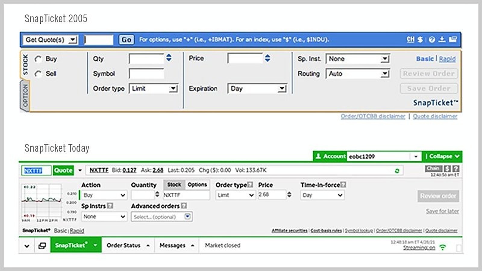
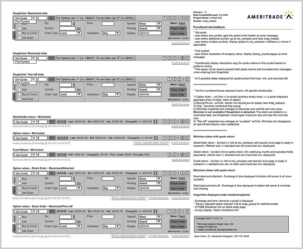
The centerpiece was SnapTicket, a compact trade ticket that kept traders one click from acting on a position. It sat persistently in the footer, with live quotes and the watchlist in its header. Its fields changed with the type of order, so a market order had no price field while a trailing stop had several. It collapsed after a trade to free up the screen. And it could snap off the browser into its own small window, so traders could research anywhere and still open or close a position instantly. Ameritrade later featured it in a TV spot.
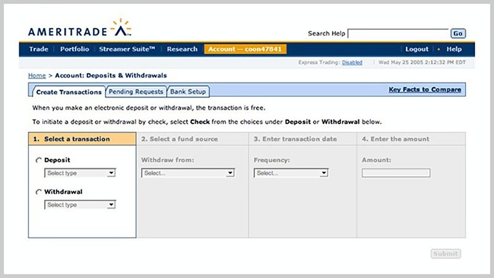
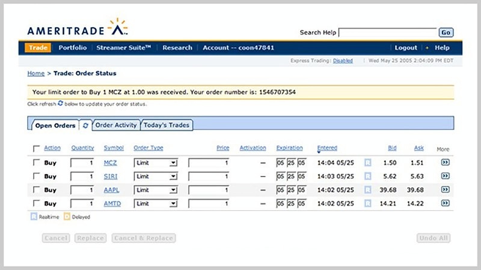
Around it, we removed friction from every step. Following a Cooper principle, don’t allow errors if they can be prevented, forms checked each field as clients moved through them and enabled submission only once entries were valid, ending the error loops that had plagued both legacy platforms. Multi-page tasks like deposits and withdrawals became single, conditional forms. After a trade, Apex took clients straight to their open orders with a confirmation, so they could see the order had been placed, adjust a limit order before it filled, or manage orders placed after hours. Task completion improved and client complaints dropped.
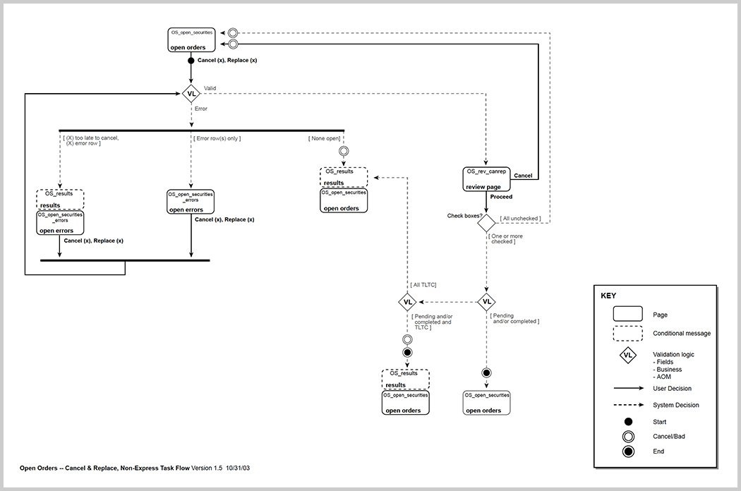
My front-end engineers pushed the browser further than its frameworks were built to go, and with my interaction designers produced skeleton prototypes of our key scenarios for feedback from clients, engineers, and stakeholders. I mapped flows like canceling and replacing an order in detail, to work through the logic with engineering.
Put the work in front of the industry’s judge
Barron’s, the Dow Jones weekly for investors, ran the review the market trusted. Its annual online broker review, which contributing editor Theresa W. Carey founded in 1996 and wrote each year, scored brokers on criteria like the trade experience, usability, technology, and range of offerings, and its ratings carried weight with prospective clients and with the industry. Brokers publicized their results, and the review was the closest thing the market had to an independent measure of the experience we had redesigned.
The year before Apex, Ameritrade had earned 2.5 stars and 12th place. We had business metrics to hit, with number of trades and new clients at the top of the list, but leadership treated a strong review as mission-critical. The online brokerage market was crowded with hard-charging competitors, Ameritrade was absorbing one acquisition after another, and merger rumors were in the air. The review would judge exactly what we had spent a year rebuilding: the trading experience and the technology behind it.
In the spring of 2005, I flew to Palo Alto with our director of strategy to present Apex to Theresa, walking through the platform we had designed for the active trader.
“Ameritrade, which swallowed up Bidwell & Co., Brokerage America, JB Oxford & Co. and Investex over the last year, earns four stars this year for its Apex offering. Ameritrade seriously overhauled the Website this past year, finally integrating the technology brought in with the 2002 Datek acquisition. The new site provides improved navigation, more tools and services, easier-to-find information, customization and better trading technology.”
Apex earned four stars, and Ameritrade moved to second place.
In their words
“Call it what you want—user-centered design, interaction design, user experience… For me, it didn’t exist prior to my meeting Sean. He really illustrated for me what a team can produce by focusing on the needs of the individual. He’s driven, thoughtful and creative. What more can I say?”
“Sean’s commitment to accurately identifying and consistently satisfying user needs was what made a good idea a great product. He was an inspiration, and he’s greatly missed at Ameritrade.”
Key learnings
- Unspoken priorities still get judged.This was before product management, so no one guarded the inbound asks, and every part of the business wanted a piece of what our team was producing. I said yes to all of it. I was spread across too many products and business owners, and I didn’t yet understand that I needed managers under me to lead them. Apex got my attention, and the rest slipped. My priorities were real but never stated, so the people who didn’t make the list drew their own conclusions, and my reputation paid for it. With what I know now, I’d have guarded the intake, named the priorities out loud, and built a layer of managers before the work outgrew me.
- Influence moves the work; structure makes it last.In a company that spoke finance, my title didn’t move anything. Shared understanding did: engineers, analysts, and stakeholders working from the same picture of the client, and relationships with leaders in strategy, marketing, and client success. But influence lives with the person who holds it. What outlasted me was structural. Design moved out of engineering to report into the business, and the next leader inherited that seat.
- Turn an integration into a market.After the acquisition, the obvious project was technical: merge two platforms without losing either client base. Naming the active trader turned it into a growth bet. Someone making 10 to 20 trades a month paid less in commission than a day trader, but there were far more of them, and neither brand served them well. That one definition did three jobs. It gave leadership a reason to fund a new platform, gave product marketing a story it could sell, and gave design a primary persona, with day traders and long-term investors as the scenarios Apex still had to support. When two products have to become one, the strongest move is often to design for the customer neither was built for.
Questions about this project? Email me.