Case studyMedia Matters for AmericaMedia
Making media research findable, for the people who share it
In 2005, Media Matters for America needed its site to keep up with the explosion of political blogs. Teaming up with Khoi Vinh of Behavior Design, I led the information architecture and interaction design: design personas built in a workshop with MMfA’s research fellows, context scenarios that set priorities, a structured tagging scheme across every piece of published content, and template sketches that Khoi carried into the interface.
- Client
- Media Matters for America, a nonprofit media research center
- Partner
- Behavior Design, with Khoi Vinh
- My role
- Information architecture and interaction design, brought in by Khoi
- When
- 2005, a four-month engagement
- Team
- Khoi on interface design, me on structure and interaction
Results
What changed
- 1 → 4audiences designed for, up from the political blogger the team already knew
- Date → issuehow content could be found: by the people, outlets, and issues it covered, not only when it was posted
- Roadmapprioritized scenarios to build now, and a backlog MMfA could pursue after we left
The redesign launched in the fall of 2005 and was up for a 2006 SXSW Web Award. This was a consulting engagement, and I don’t have analytics from after launch. In the years that followed, MMfA’s relationships with CNN and MSNBC grew from tentative to recurring appearances by its research fellows. I can’t attribute that to the redesign, but the platform was built to make their research easy to find and share.
The problem
Media Matters for America had launched a few years earlier, and its site couldn’t keep up with the traffic that came with the explosion of political blogs. This is how MMfA described itself:
“Media Matters for America is a Web-based, not-for-profit, 501(c)(3) progressive research and information center dedicated to comprehensively monitoring, analyzing, and correcting conservative misinformation in the U.S. media.”
While I was founding my studio, dotmatrix studios, in North Carolina, I had feelers out for new work when a chance came to collaborate with Khoi Vinh, then founder and principal of Behavior Design. Within weeks we had started with MMfA. The team we worked with was led by a handful of senior research fellows who produced the site’s long-form content. Our engagement was to establish an extensible interface that could handle the operation’s projected scale, firm up its design language and patterns, and re-architect the site so specific content was more useful, findable, and visible.
The existing site was organized like a newsroom’s front page. The newest items led, older ones fell into the archives, and a reader who wanted everything MMfA had published about a particular commentator, outlet, or issue had to search for it.
The system
MMfA’s research only mattered if it reached the people who could use it:
- Research fellowsMonitor media coverage and publish research, video, and articles
- The siteOrganizes it so each piece can be found from many directions
- AudiencesBloggers, journalists, activists, and congressional staff find what they need
- The wider mediaThey share, cite, and embed it, carrying it beyond the site
The work carried six constraints:
- No research budgetThere was no money for interviews or a mixed-method study
- Analytics without the whyMMfA could see what people visited, but not what they were trying to do
- Rising trafficPolitical blogs were driving more visitors than the site was built to serve
- Many content typesResearch, video, and articles all had to be findable together
- Before social mediaSharing meant blogs, email, and embeds, not feeds
- A skeptical roomLeadership wanted to know how we could know who the audience was
What I did
MMfA knew a lot about its audience, but that knowledge lived in its staff’s heads. My strategy was to turn it into personas and scenarios the whole team could design against, then build the structure, a consistent way to tag and connect everything published, that would let each of those people find what they needed.
In practice, that meant:
- Model the audience without a research budget. Draw it out of the people who knew it best.
- Picture success before designing screens. Write scenarios, then let them set priorities.
- Build the structure, then the interface on top of it. Tag everything consistently, sketch the pages as modules, and hand them to the grid.
Model the audience without a research budget
MMfA’s analytics showed what people did, but not why. The team had solid assumptions about general use, but I wanted to understand the deeper range of needs across their community. With no budget for a mixed-method study, I ran a workshop with their research fellows, political consultants, and subject matter experts to map the ecosystem: which archetypes were in play, and how could MMfA serve them best?
With sticky pads and markers, I set up in their war room in downtown Washington, D.C., and started at the beginning:
- What do we know about the people who come to the site today?
- What areas do they visit often, and do we know what they do there?
- How might we better serve their needs?
- Who might not know about MMfA but should?
- Is there a chance to build programs or community around misinformation?
- If we had a magic wand, how would MMfA exist in this ecosystem?
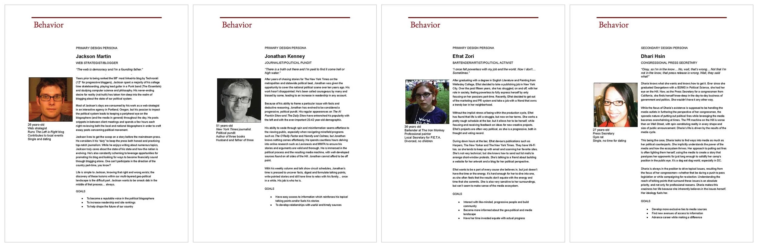
We began with a solid understanding of the primary users, political bloggers, and as we documented goals and behaviors, we explored analogous users with more nuanced needs. By the end of the workshop, our original “share and embed content” user had split into enough distinct patterns to model three primary personas and one secondary:
- The political blogger. Bloggers were multiplying. Even before social media, the need was familiar: make content findable, digestible, and easy to share.
- The journalist. The team knew reporters used the site for research. We saw a chance to push topic-specific research to them directly.
- The activist. Anti-war activists wanted to hold media coverage to account. MMfA could become a place for discussion and media activism tips.
- The congressional staffer. Staffers dealt with the media and brought ideas to their members. MMfA could reach them through outreach that shared its research with their offices.
In the review with leadership, I was asked how I knew these were the full set of market needs. The language of hypotheses wasn’t second nature to me in 2005, but my answer was in the same ballpark: it was an educated guess. We didn’t know anything with certainty, but we trusted the cumulative knowledge in the room, and a human-centered framing would help the team make sharper decisions once real people used the new platform.
Picture success before designing screens
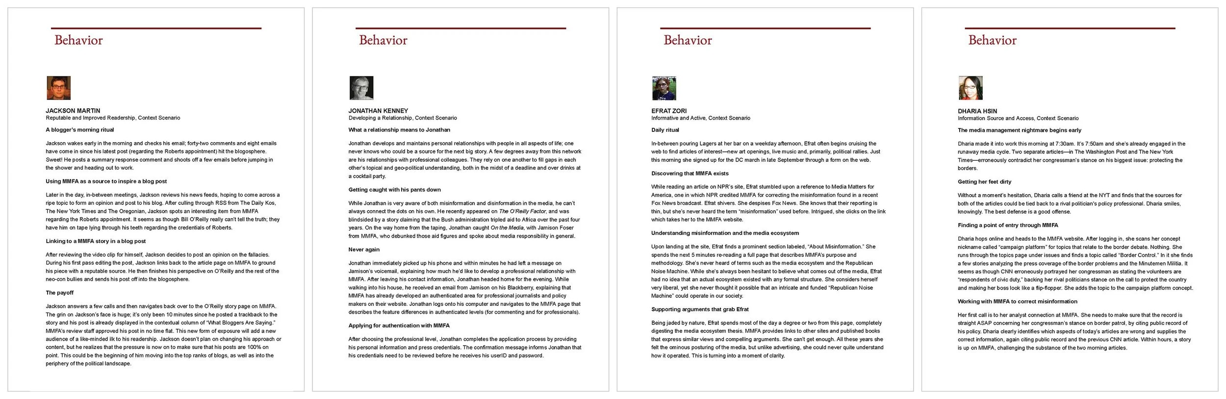
Once we agreed on the personas, I wrote context scenarios for each one, describing their needs and what the MMfA platform could do for them. Scenarios let me map out interactions that supported each person’s goals without platform constraints, align the team on value to the mission, and prioritize which scenarios to build first while backlogging the rest for MMfA to pursue later.
Each scenario followed one person through a believable day. The blogger’s began with his morning routine: comments and emails on his latest post, then a scan of his RSS feeds from Daily Kos, The New York Times, and his local paper. He spots an MMfA item with video of a cable host misstating a nominee’s credentials, watches the clip, and writes a post linking to MMfA as his source. Ten minutes later his post appears in a “What Bloggers Are Saying” column beside the original story, after MMfA staff approve the trackback, and his blog gains a new audience.
Written that way, a scenario does work a feature list can’t. It shows what matters to the person, in what order, and where MMfA can earn a place in a routine that already exists. That one scenario set requirements for permalinks to every item, embeddable video, trackbacks with a staff review step, and a module that turned other people’s coverage into proof of MMfA’s reach. The journalist’s scenario pointed to research organized by topic and delivered to them; the activist’s to discussion and practical tips; the staffer’s to material they could pass to their office.
I walked our clients through each scenario, joined the discussions about impact and feasibility, and revised where needed. Once we agreed on how to support each archetype, I documented the key paths that would serve as requirements for the interfaces to come, everything from content widgets to campaigns on search results to page templates.
Build the structure, then the interface on top of it
The old site organized content by date, so items faded as soon as something newer was posted. For an organization whose value was a growing record of who said what, and where, that was backwards.
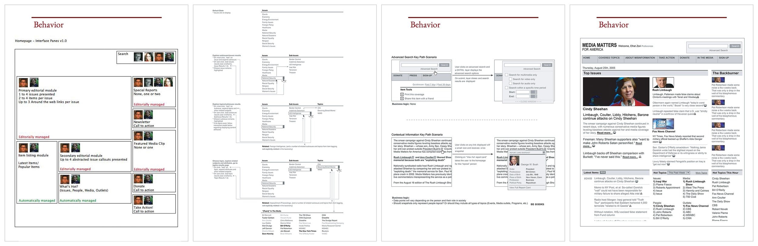
In 2005, tagging was everywhere, but the del.icio.us and Flickr kind let anyone label anything, and the results were loose and inconsistent. Library science offered the alternative: a controlled vocabulary, applied consistently by the people who know the content. I chose that approach. Staff tagged everything MMfA published against a consistent set of facets: people, outlets and programs, and issues. Each person, outlet, and issue got a page collecting everything MMfA had published about it, and the same tags powered related-content modules and topic feeds.
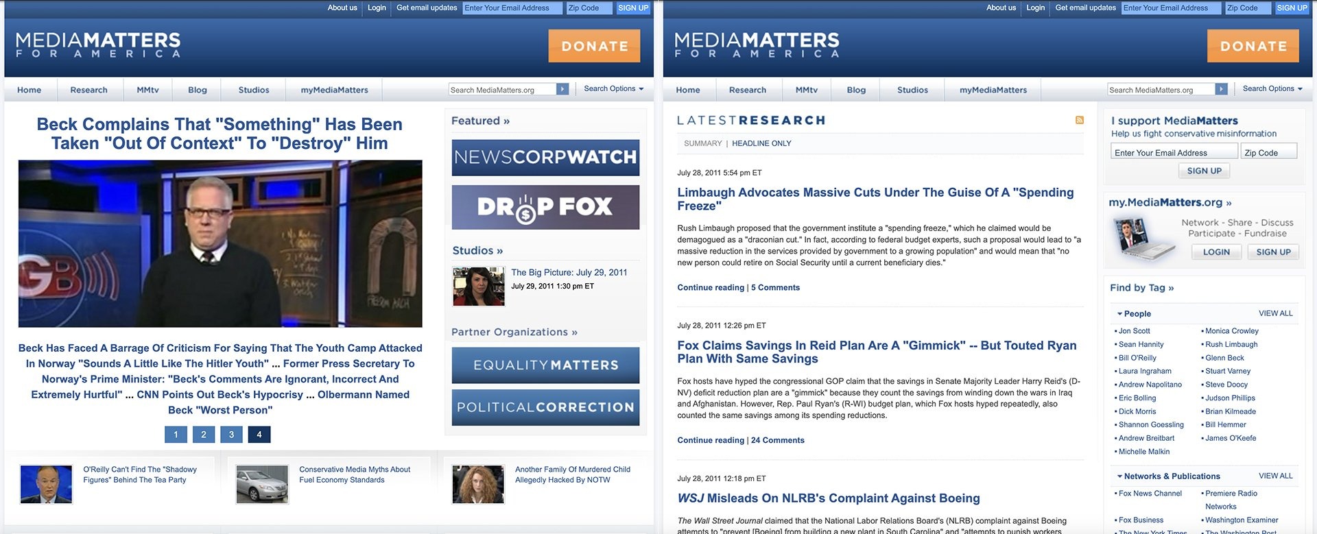
On top of that structure, I sketched the core pages as systems of modules rather than finished layouts, so they could recombine as MMfA grew. Every module carried thumbnails of the personas it served, which kept reviews focused on whom each part of the page was for. As the sketches gained fidelity, Khoi, known for his grids and minimal visual style, set the interface patterns, typography, and palette in parallel. My modules and his grid fit together without a hand-off.
Key learnings
- Call personas what they are: hypotheses.When leadership asked how I knew our personas were right, the honest answer was that I didn’t. They were an educated guess built from the knowledge in the room. That was the right call without a research budget, but I didn’t have the language to defend it. Today I’d frame personas as hypotheses from the start, and agree with the client on how we’d test them once real people used the platform.
- Scenarios can turn a workshop into a roadmap, if the client is serving its users.The personas told us who; the scenarios showed what success looked like for each, without platform constraints. Written out, they let MMfA prioritize what to build first and gave it a backlog to pursue on its own. But scenarios only carry that weight when the client is genuinely trying to serve the people in them. MMfA was: its research only mattered if bloggers, journalists, and staffers used it, so the scenarios described the organization’s own success. When a client’s real goal is something else, like a feature a stakeholder already wants or a metric that doesn’t depend on users, scenarios become a formality, approved and then ignored. I learned to watch for that early, because it tells me whether user-centered artifacts will steer the work or decorate it.
- Structure outlasts the interface.Visual design is the first thing a client sees and the first thing that gets redesigned. Navigation, layouts, and palettes date quickly. A well-modeled content structure keeps working underneath them. For MMfA, the tagging scheme was invisible next to the new design, but it did the most durable work: every new item made the record more useful, and pages for each person, outlet, and issue grew on their own without anyone redesigning them. It also made the content portable to whatever came next, new templates, feeds, or channels, because the meaning lived in the data, not the page. When time or budget is tight, I push for the structure first. A good interface on a weak model has to be rebuilt; a strong model can carry several interfaces.
- Make the invisible work visible.Working beside a designer as well known as Khoi, it would have been easy for the client to see only the interface. Architecture, tagging, and scenarios don’t show up in a screenshot. Putting persona thumbnails on every module of my sketches made the reasoning visible, so the client could see why each part of the page existed and who it was for. I’ve made a habit of that since: when structural work sits beside visual work, show the client the thinking, not just the result.
Questions about this project? Email me.