Case studyEyewebRetail
Designing a zero-to-one eyewear store, from browser to fitting kiosk
In 1998, a founder walked into Organic in New York wanting people to discover and buy fashion and prescription eyewear online, at a time when most people were still wary of typing a credit card into a website. On my first project as an information architect, mentored by Robert Fabricant, Organic’s chief information architect, I designed the architecture of a new retail brand: frame search, a personal collection, a visual frame advisor, and an in-store measurement kiosk that powered fittings at home. We took it from idea to launch in about nine months.
- Client
- Eyeweb, an online eyewear startup
- Agency
- Organic Online, New York
- My role
- Information architect
- When
- 1998, about nine months
- Mentor
- Robert Fabricant, Organic’s Chief Information Architect
Results
What we launched
- 9 mofrom an idea with minimal definition to a launched brand and platform
- 2form factors, a website and an in-store kiosk, sharing one architecture
- 1,000sof frames from the LensCrafters collection, searchable and fittable online
This was an agency engagement, and I don’t have access to the business results. The Eyeweb name still sells eyewear online today.
The bet
Six years after Book Stacks Unlimited went live, and three years into Amazon and eBay, a large share of people still wouldn’t buy anything online with a credit card. Eyeweb’s founder wanted to move the way people discovered and bought fashion and prescription eyewear from the store to the screen.
The idea arrived with minimal definition. There was no brand yet, no architecture, and no answer to how someone could choose glasses they couldn’t hold. I worked within a multidisciplinary Organic team of strategists, designers, and engineers to build all three.
The system
Every frame in the catalog carried descriptive attributes, and the experience ran on them from store to doorstep:
- In storeA kiosk measures the shopper’s face and captures a headshot
- DiscoverSearch, frame details, and the frame advisor match frames by attribute
- CollectFavorites gather in a personal collection to compare and sort
- At homeThe shopper tries frames on their own face, picks a lens, and orders
Each part of the system carried its own constraint:
- Trust came firstMany shoppers were still wary of buying anything online
- Shoppers thought in storesTheir mental model was browsing and trying on in person
- Small screensMore than 70% of the market had displays 800×600 or smaller
- No dynamic recommendationsWe had no collaborative filtering or attribute-based co-occurrence to lean on
- A public kioskShoppers would be measured in front of other customers
- Something differentThe founder wanted a discovery experience unlike anything else online
What I did
Every frame came with attributes like brand, shape, material, color, and price. My strategy was to make those attributes the backbone of the experience, one structure behind search, the frame detail, the personal collection, the frame advisor, and the fitting, and to present it in the language of a store people already trusted.
In practice, that meant:
- Architect the brand as it took shape. Turn workshop consensus into organizing principles, hierarchy, and navigation.
- Bring the store’s service into the browser. Give shoppers the language and care of a luxury shop, not a database.
- Let the attributes do the merchandising. Expose what a frame is made of, so every frame leads to the next.
- Turn preferences into pictures. Make recommendation feel like style, not a questionnaire.
- Design the kiosk for the least confident shopper. Measure a face in public without anyone struggling in view.
Architect the brand as it took shape
We started on the ground floor, workshopping rounds of images, keywords, and brand stories. Fanny Krivoy ran the brand exercise with the visual design team, while Robert presented our ecosystem concepts to the founder as conceptual diagrams. I contributed to both, mostly as a reviewer. As the team reached consensus on the architecture, I defined the organizing principles, recall methods, interface hierarchy, navigational affordances, and widget schematics.
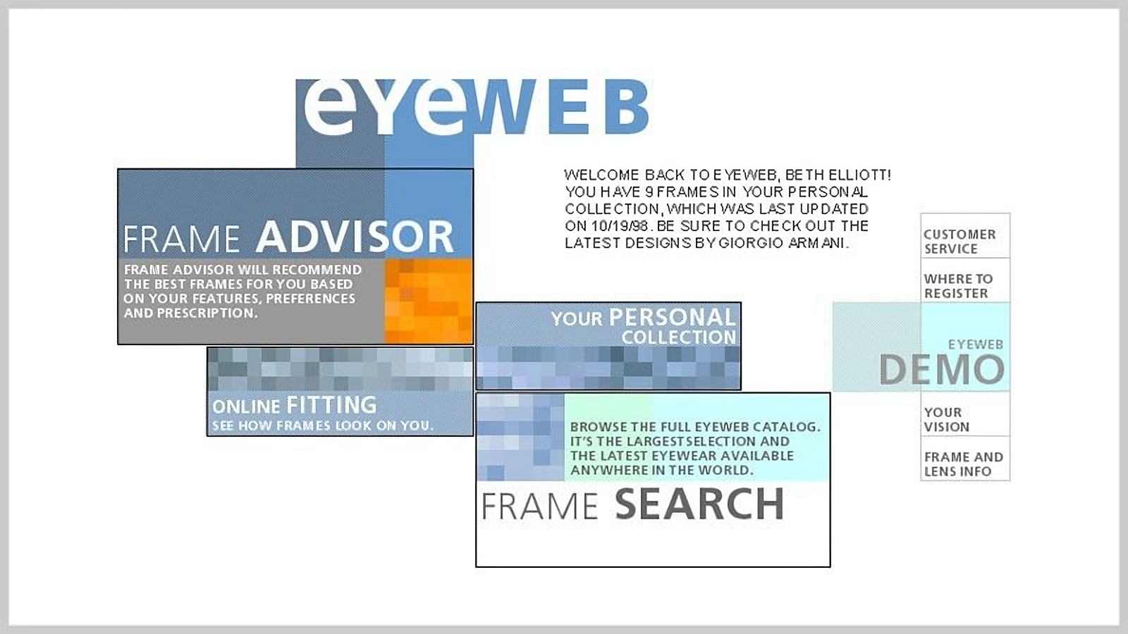
With a boutique focus on a single product, we centered the homepage on the four ways to find and try frames, and split global navigation between those features and support destinations. Naming mattered: we were moving shoppers from the habits of a real store to an experience that wasn’t yet normal, so every label had to make sense to someone who had only ever bought glasses in person. And at 800×600, every element competed for space, which limited how much white space we could use to keep the interface from feeling crowded.
Bring the store’s service into the browser
In a good optical shop, someone remembers you, sets aside the frames you liked, and tells you when something new comes in. For shoppers still wary of buying online, the personal collection was designed to carry that feeling into the browser, with the language cues they would hear in person.
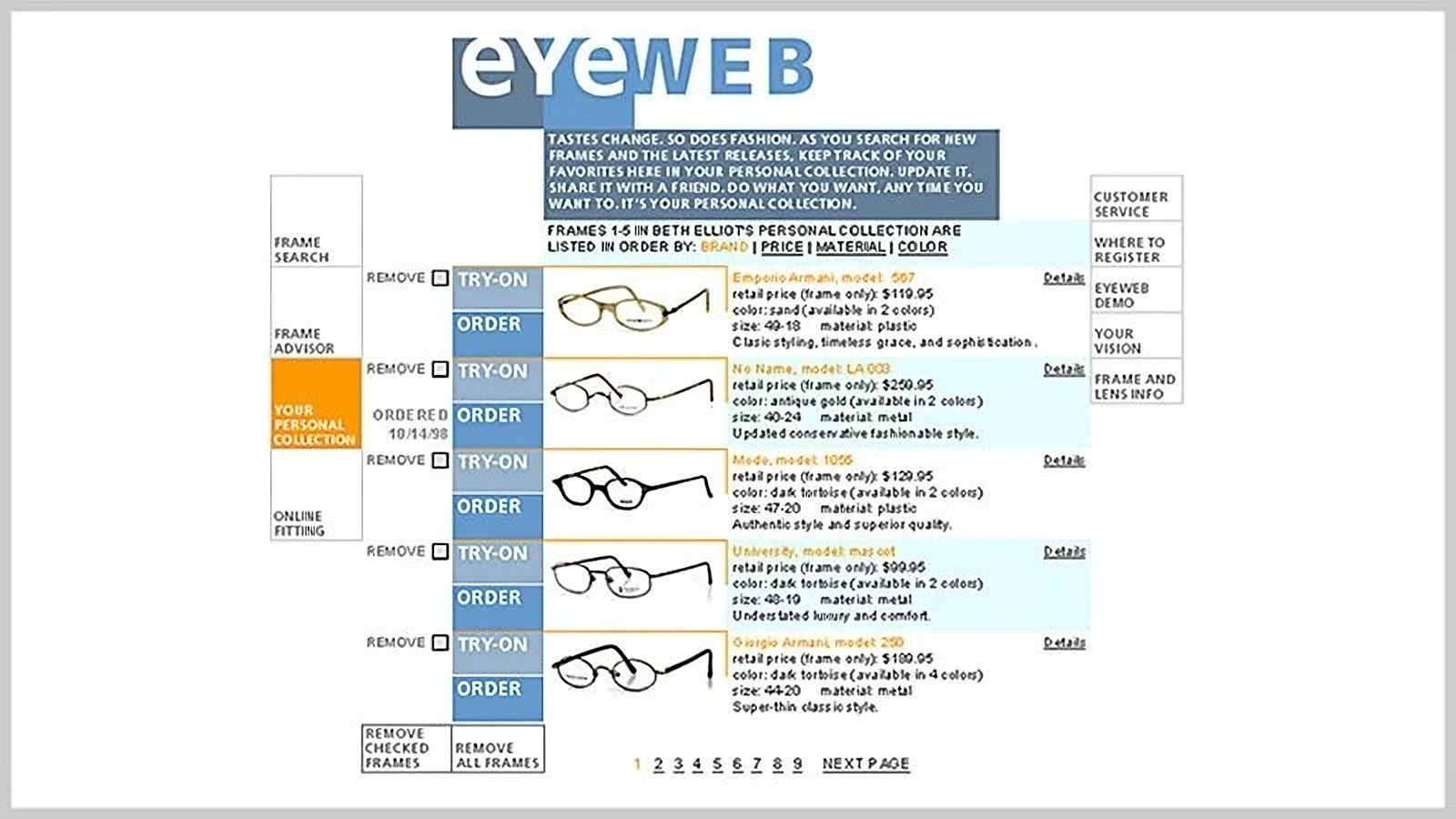
It started on the homepage. A returning shopper was greeted by name and told how many frames were waiting in their collection, when they last updated it, and which new designs to look at. Inside, the copy spoke like a shop assistant, not a database: tastes change, fashion changes, keep track of your favorites, share them with a friend.
Under the language sat everything needed to manage the collection. Shoppers could sort by brand, price, material, or color, see each frame’s price, size, material, and available colors at a glance, and remove what no longer appealed. Try-on and ordering sat beside every frame, and past orders stayed visible. The collection became the hub of the experience: discovery fed into it, and the online fitting drew from it.
Let the attributes do the merchandising
This was my first time designing search and discovery around SKU-based inventory. Every frame carried descriptive attributes, and those attributes did two jobs: they matched shoppers’ queries in frame search, and they gave the rest of the experience something to reason with.
Before time on page was a common analytics term, we aimed for stickiness. In retail the goal is a purchase, but stickiness also happens when a shopper moves from one interesting product to the next, and every step deeper raises the chance of buying.
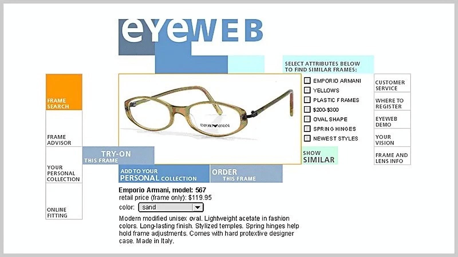
We couldn’t present related frames dynamically, through collaborative filtering or even attribute-based co-occurrence. So the frame detail put the decision in the shopper’s hands. The product image led, with try-on, add to collection, and order around it. Beside it, the frame’s attributes appeared as a checklist: brand, color family, material, price range, shape, features like spring hinges, and whether it was among the newest styles. A shopper checked the ones they cared about and asked for similar frames.
Turn preferences into pictures
Search worked for shoppers who knew what they wanted. The frame advisor was for everyone else, and it promised to recommend the best frames based on a shopper’s features, preferences, and prescription. For the most ambitious form of discovery on the site, the founder wanted something remarkably different, so different is what we aimed for.
I started with structure. I sketched a linear narrative of multiple-choice questions about style and functional preferences, built on the same frame attributes as search, the frame detail, and the personal collection. Each answer narrowed the attributes in play, and the recommendation engine queued up a matching set of frames as the shopper went.
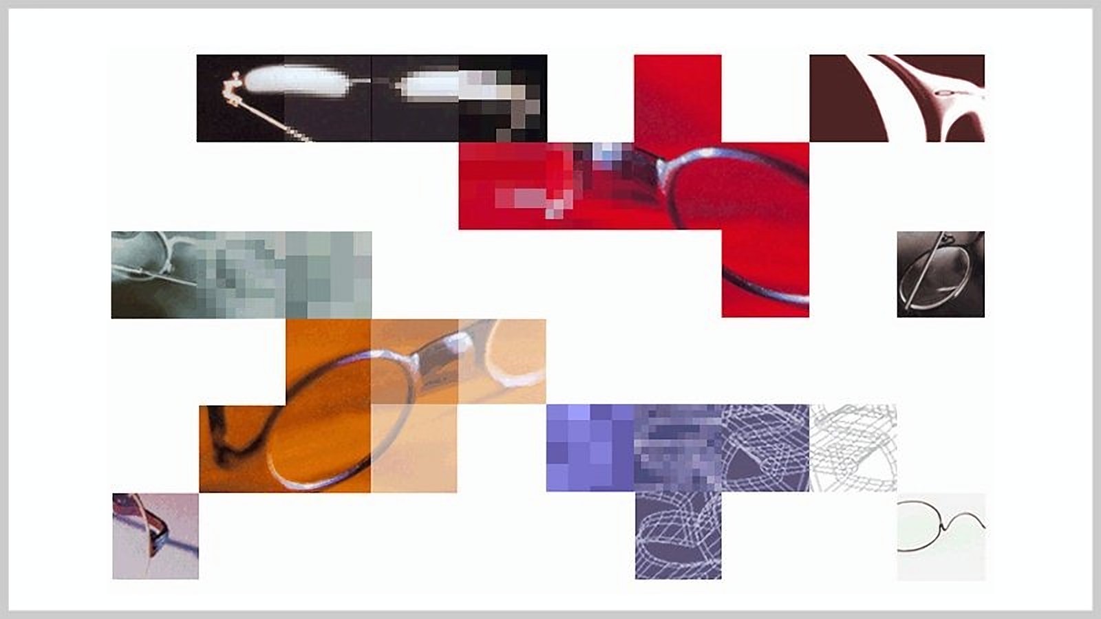
Then our visual designer took that framework and replaced the explicit questions and answers with images: cropped, pixelated close-ups of frames in different colors, materials, and textures, the same visual language as the homepage. The images sat on the grid used across the site, and the visual differences between them mapped directly to sets of frame attributes. Shoppers chose what felt like their style, and the system translated each choice into a precise query.
Design the kiosk for the least confident shopper
The in-store kiosk was a task-based interface that precisely mapped a shopper’s pupils, the space between the eyes, and the width of the nose. Shoppers would use it in public, so I kept the interaction model simple, with no extraneous copy or features. The last thing we wanted was visible frustration from the least tech-savvy shopper, surrounded by other customers.
I carried the site’s brand and navigation patterns into the kiosk and designed a simple way to drag measurement points into position. Each step was clearly labeled, with easy navigation forward and back.
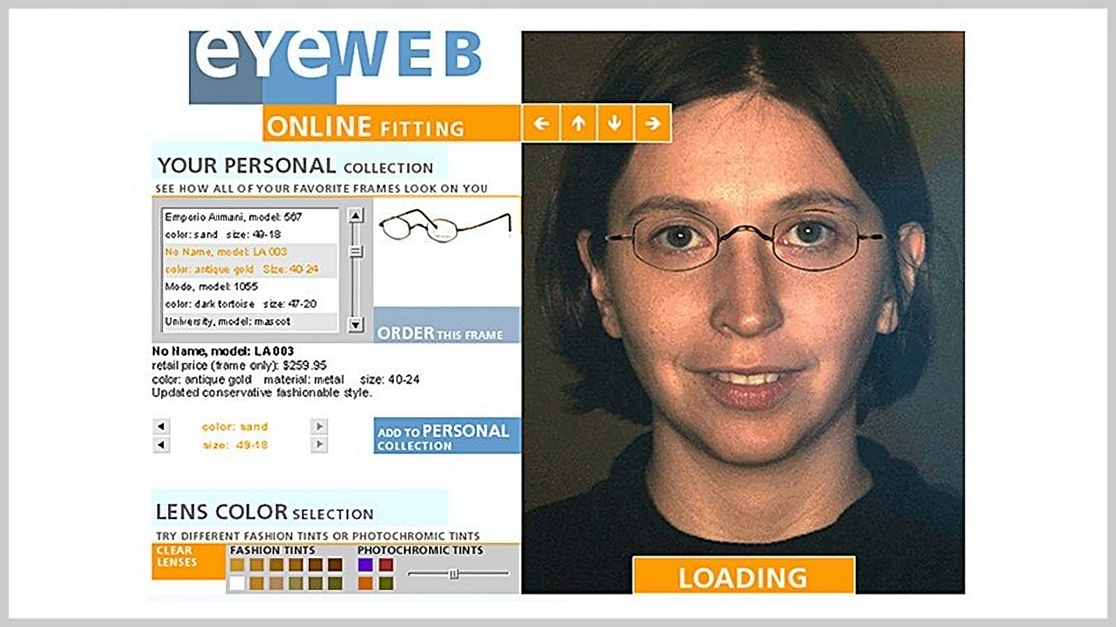
Once their likeness was captured, a shopper could dial in from home and try on any frame in the catalog. The fitting placed their measurement-precise headshot beside their personal collection, with a choice of fashion tints and photochromic lenses, and then it was on to checkout.
Key learnings
- People adopt new behavior through familiar patterns.In 1998, people didn’t trust buying online, so we made Eyeweb feel like a store they already trusted: the language of a personal shopper, a fitting that started in person. Every new channel faces the same problem, from e-commerce then to AI agents now. People adopt the unfamiliar when it borrows the shape of something they already rely on.
- The data model is the first recommendation engine.We had no collaborative filtering, so well-modeled frame attributes did the work: search, the frame detail, the personal collection, and the advisor all ran on them. Recommendation systems have improved enormously since, but they still lean on the same foundation: well-structured product data. It’s unglamorous work, and it’s where personalization starts.
- Expressive inputs need explicit mappings.The frame advisor let shoppers answer with images instead of checkboxes, and every image resolved to specific frame attributes. Conversational and visual interfaces work the same way today. The more expressive the input, the more deliberately someone has to design what it means to the system underneath.
- Design for the person being watched.The kiosk measured a shopper’s face in the middle of a store, with other customers around. I kept it to a few clearly labeled steps, cut every word and feature that wasn’t needed, reused the website’s patterns so it felt familiar, and made measuring as simple as dragging points into place. At the time, I just didn’t want anyone to struggle in front of strangers. In hindsight, it’s a principle: when people use something in public or under pressure, every extra choice is a chance to look lost, so cut until there’s nothing left to get wrong.
- Give people real responsibility early, with support.This was my first project as an information architect, and I learned the craft because a mentor gave me a zero-to-one system and the support to do it well. It’s how I’ve tried to grow designers since: real responsibility early, with someone experienced close enough to catch what they can’t see yet.
Questions about this project? Email me.