Case studyAquariumScientific research
Designing Aquarium for the labs beyond the one that built it
Aquarium is the University of Washington’s laboratory operating system. Protocols are written as code and carried out step by step by human technicians, so an experiment runs the same way every time. It powered the UW BIOFAB, but it had been built by and for that one lab. During an 18-month, DARPA-funded push on usability, I worked to open it up to researchers who don’t write code, and made the case that it could serve labs well beyond the BIOFAB.
- Organization
- University of Washington, Electrical & Computer Engineering
- My role
- Design advisor
- When
- June 2020 to November 2021
- Funding
- DARPA, an 18-month extension focused on usability
- Users
- Researchers, lab managers, and technicians at the BIOFAB and Baker Lab
The platform
Most academic labs can’t afford robotic automation, so their experiments depend on how each person runs a protocol that day. Aquarium’s answer was human-in-the-loop automation.
- ResearcherDesigns a plan by wiring protocol steps into a workflow
- Lab managerBatches the steps into jobs and assigns technicians
- TechnicianFollows on-screen instructions at the bench, step by step
- AquariumRecords every step: who, which samples, what data, how long
The model worked. Between 2014 and 2020, the BIOFAB ran more than 30,000 jobs for 319 users and built more than 5,700 yeast strains, most of them carried out by undergraduate technicians. At least eight other groups set up Aquarium servers of their own, for work ranging from plant transgenics to biomedical diagnostics. In DARPA’s Synergistic Discovery and Design program, Aquarium was one of the main ways protocols traveled between labs.
Figures from Vrana et al., “Aquarium: open-source laboratory software for design, execution and data management,” Synthetic Biology, 2021, and Leins et al., Digital Discovery, 2023.
The challenge
I joined in June 2020, after Aquarium’s original four years of DARPA funding, for an 18-month extension focused on usability.
The work was remote from the start. The lab kept running, with technicians masked at the bench, and I was on campus only a handful of times. My job was to make Aquarium’s interfaces more usable, and wherever possible to replace the need for code with direct, visual ways of working. Three things stood in the way:
- Code was the front doorProtocols and workflows were written in Krill, a Ruby-based language, so building anything new meant writing code.
- Tables, not workflowsMost screens were tables of records. Researchers could see their data, but rarely the shape of the experiment it came from.
- Built around one labInventory was modeled on the BIOFAB’s own freezers and shelves, so the software assumed one lab’s physical layout.
What I did
I came from product companies, where software has to earn its users. I approached Aquarium the same way, with a strategy I summed up as “first easy to use, then more useful.”
Track one
First, easy to use
Find out what the team believed Aquarium was for, then fix what every user touched, starting with the screen they all shared.
Ask the team what Aquarium is for
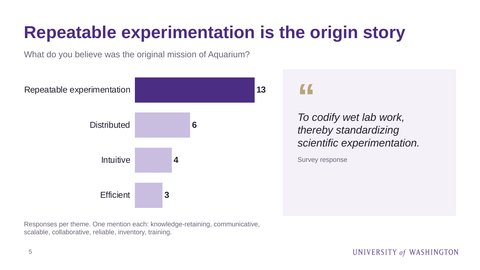
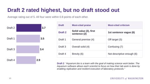
Two months in, I couldn’t find a shared answer to a basic question: what was Aquarium’s mission? So I asked everyone close to it. In August 2020 I surveyed 16 people, including current and past users and the product team, with six open questions and four draft mission statements to rate.
The team agreed on where Aquarium came from: 13 responses named repeatable experimentation as its original mission. They didn’t agree on where it should go. Views of its value varied by role, best practices like reproducibility were confused with larger market opportunities, and no draft mission stood out, with all four rated within 0.8 points of each other. The findings became the input to a product design roadmap.
Start with the humans in the loop
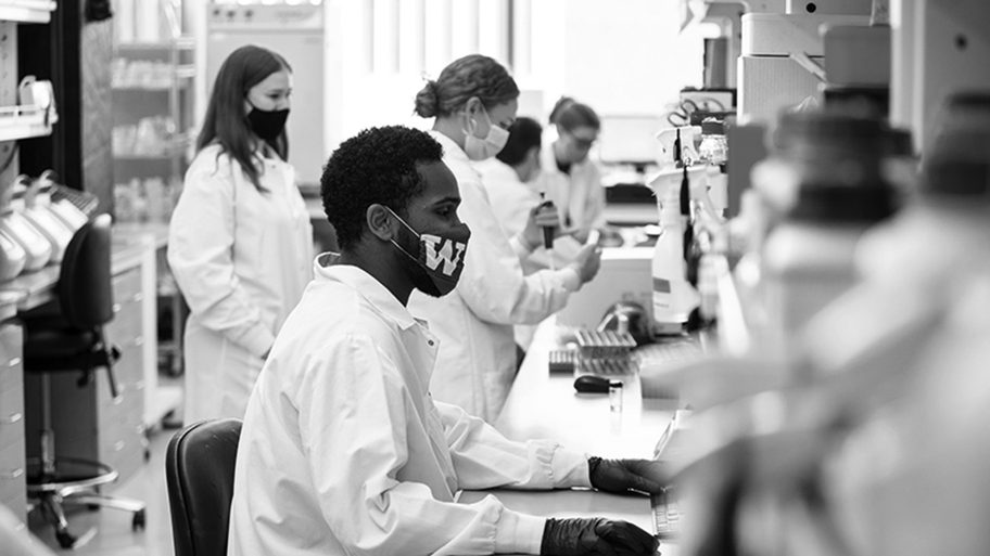
Aquarium’s reliability rested on technicians following instructions exactly, so they were the first people I studied. Most were undergraduates, some in their first or second year, who learned the basics from the lab managers and then built skill by repeating protocols step by step on screens around the lab. By the time I joined, they were doing it in masks, under pandemic distancing.
I sat with them in the lab to understand how they moved between the bench, the samples, and the screens. Researchers designed the experiments, but technicians were the system’s most frequent users, and every interface I touched had to fit their hands and their pace.
The survey had shown the same pattern from the other side: each role needed something different from the same software.
- ResearchersReproducible experiments they could design, rerun, and share
- Lab managersAn efficient lab: work batched, assigned, and tracked
- TechniciansClear, intuitive instructions to finish each assigned task
Sequence the work
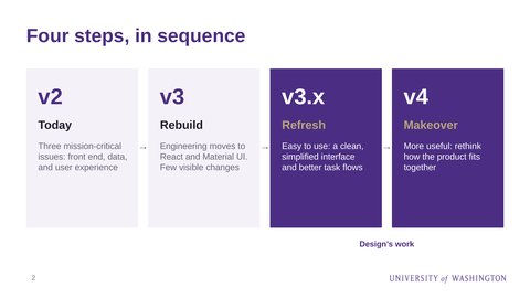
In November 2020 I presented a product design roadmap in four steps. Engineering was already rebuilding the front end in React with Material UI components, which would change little that users could see. Design would follow with a Refresh to make Aquarium easy to use, then a Makeover to make it more useful.
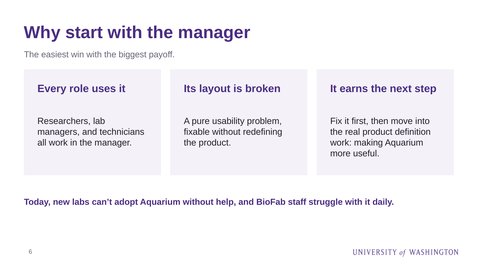
The Refresh started at the surface: visual design, content and naming, and UI patterns. It also started with the manager, the screen every role used. Its layout was broken, a pure usability problem, so it was the easiest win with the biggest payoff, and fixing it would earn the room to work on the harder question of what the product should become. Success meant easier days for lab managers, faster onboarding for new staff, and use beyond the BIOFAB.
Make the lab’s work visible
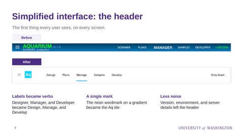
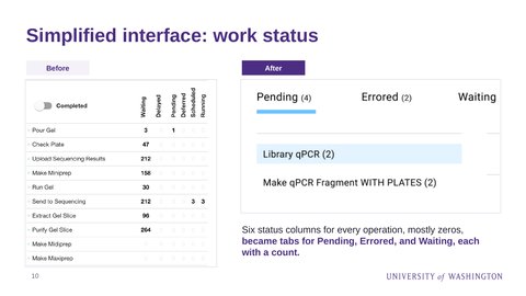
The Refresh simplified the parts of the manager everyone used. The header lost its version and server details, and its labels became verbs: Design, Plans, Manage, Samples, Develop. A grid of six status columns, mostly zeros, became tabs for pending, errored, and waiting work, each with a count.
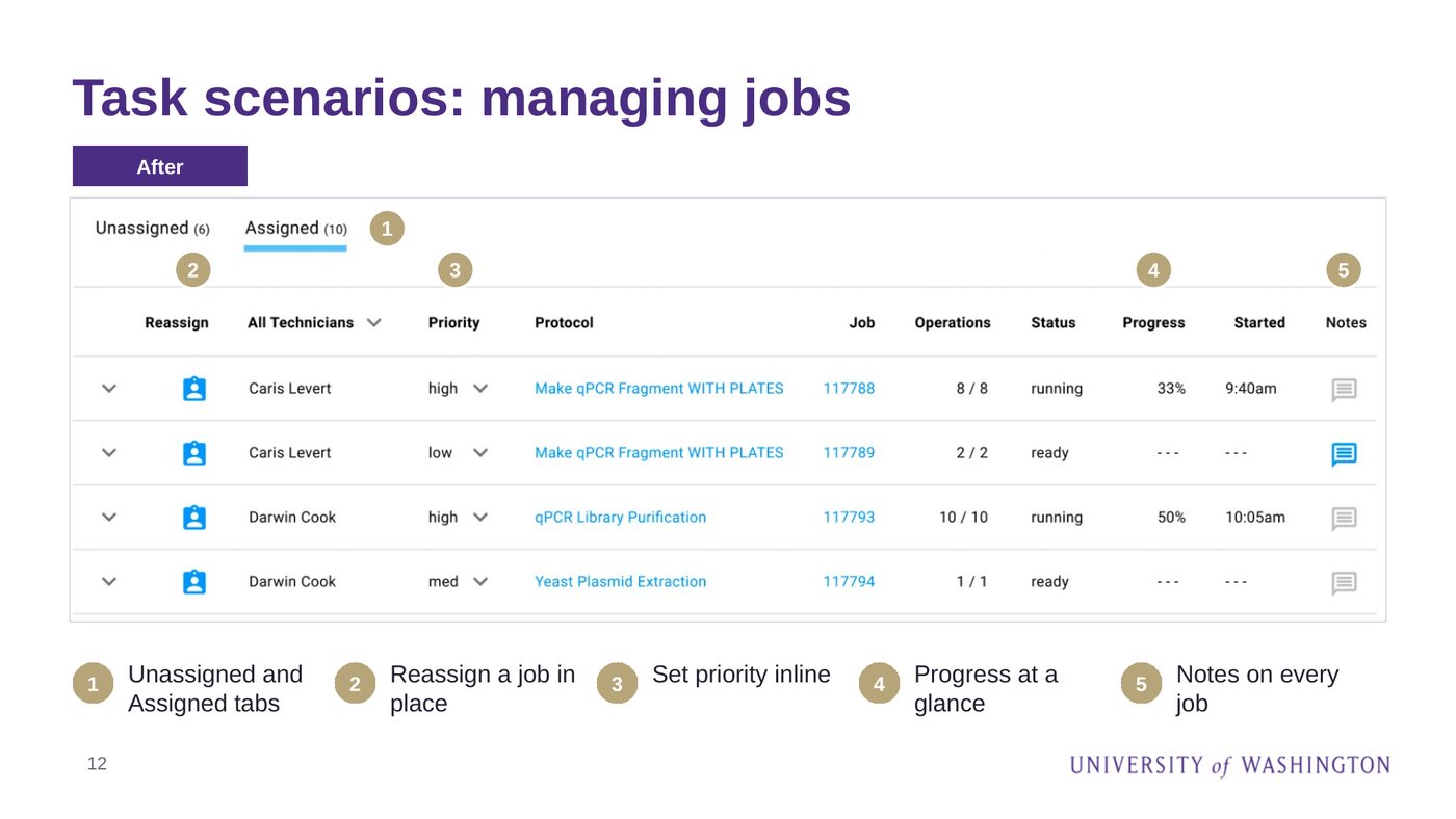
The job manager was rebuilt around the questions a lab manager asks: which jobs are unassigned or assigned, who has each one, its priority and progress, and any notes. Opening a job shows its plan, every input and output, and when each operation last changed, without leaving the list.
Give it an identity and a front door
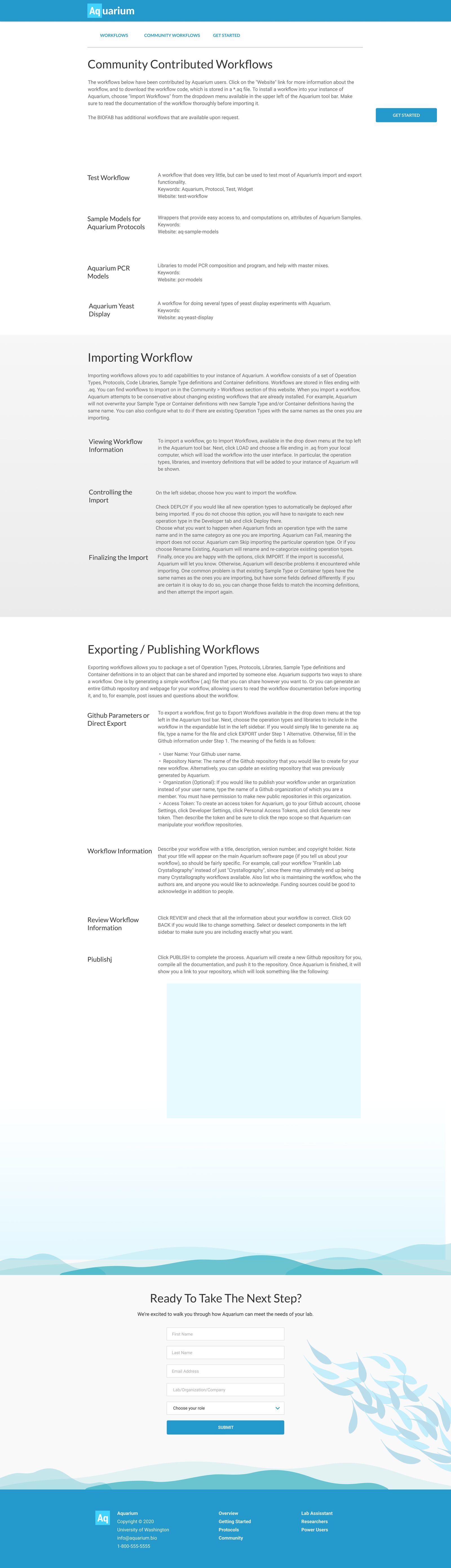
Aquarium was open source, but there was little to draw a community in. I sharpened its mark into a periodic-table tile, “Aq,” and carried its color system through the product. Then I brought in Ray Mancini, a designer I’ve worked with for years, to design a public site while I focused on the product. The site was organized around the people who would use Aquarium: lab assistants, researchers, and power users. It gave the community a place to share and import workflows, and gave labs a clear way to ask how Aquarium could work for them.
Track two
Then, more useful
Make Aquarium work the way researchers think, and for labs beyond the one that built it.
Design for changing one thing at a time
Reproducibility was the point of the whole system. In Aquarium, an experiment is a plan: a chain of operations, each with its own inputs, such as PCR, DNA assembly, bacterial transformation, and plasmid purification. A researcher should be able to run that plan once, then run it again with one input changed, knowing everything else stays exactly the same.
That’s how science isolates a variable, and it’s also how a result earns trust: if a change to one input is the only difference between two runs, the difference in their results belongs to that input. But changing a plan meant working in code, and every manual rebuild was a chance for an unintended difference to slip in.
I designed toward making that change visual and safe: a test environment for protocols, a visualization of how an experiment moves through its steps, and data management screens that make a run easy to compare with the one before it. The team saw the same need. Among their ideas for Aquarium’s future were “DIY protocol creation without code” and “easily created, highly flexible, unique workflow designs.”
- PCR
- DNA assembly
- Transformation
- Purification
- PCR
- DNA assemblyone input changed
- Transformation
- Purification
Everything else stays identical, so A versus B shows the effect of that one input.
Imagine Aquarium as a suite of apps
Aquarium’s inventory mirrored the BIOFAB’s physical space, down to its storage, which quietly limited it to that lab. I argued, along with others on the team, that it should model samples and containers in a way any lab could configure.
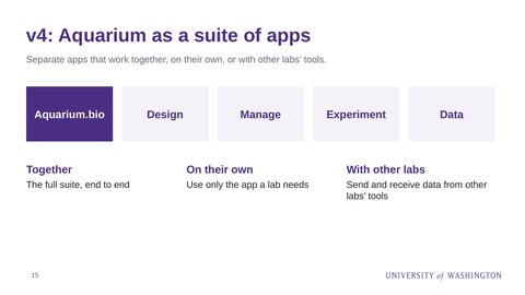
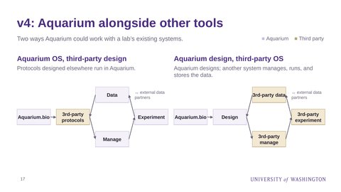
The roadmap’s Makeover took that further. I proposed breaking Aquarium into separate apps for design, management, experiments, and data. Labs could use them together, on their own, or alongside other labs’ tools, sending and receiving data. The roadmap laid out four ways that could work, from a full suite to Aquarium handling design while another system ran the lab.
The bigger idea
I kept asking a product question: why was this only for the BIOFAB?
Any university lab doing repetitive bench work, in biology or beyond, has the same problem Aquarium solved. The signs of demand were already there: other groups running their own servers, a spinout company, Aquarium LLC, based at UW’s CoMotion incubator, and a federal program using it to share protocols between institutions.
But an academic lab and a product team run on different clocks. A lab’s work is organized around grants, papers, and the students who write them. A product’s work is organized around the people who use it and the market it could reach. The roadmap asked the team to choose a direction for the Makeover. The grant ended before one was chosen.
Key learnings
- Know how the work will be judged.In commercial tech, a product is judged by its users and the business it builds, so design decisions trace back to adoption and revenue. In an academic lab, the work is judged by publications, the students it trains, and the next grant, and software is a means to that research. Both are legitimate, but they reward different things. I brought a product playbook into a research setting. Today I’d ask in the first week how the work will be judged, and by whom, and make my case in those terms.
- Funding sets the clock.A company’s momentum compounds as long as the product keeps earning its place. A grant has a fixed end, and teams form and disband around it as people finish degrees and move to their next role. Product work in that setting has to be tied to the next proposal from the start, or planned as a handoff. Otherwise it simply runs out of time.
- Agreeing on what to build isn’t agreeing on why.The survey and roadmap got the team to agree on what to build next, but not on why Aquarium should exist beyond the BIOFAB. I had a sequence of work people could nod along to, and no shared destination to pull them toward it. A roadmap sequences work; a vision gives people a reason to fund it, staff it, and carry it forward. Without that why, there was nothing for the next grant to be written around.
- Software built around one lab is still a prototype.Encoding one site’s physical layout made Aquarium work well in the BIOFAB and harder to adopt anywhere else. Commercial products are pushed to generalize by their second customer. Research software rarely meets that second customer, so it has to be designed for configuration on purpose.
- The humans in the loop are users too.Human-in-the-loop automation is only as reliable as the instructions people follow. Technicians were the system’s most frequent users, and the clarity of their instructions set the quality of the science. In a lab, usability isn’t polish; it’s part of the method.
Questions about this project? Email me.