Converting Bounces Into Revenue
FXCM, the top trading platform in the Forex market, reached out to have a conversation about their inordinately high bounce rate throughout their marketing site. The primary goal of their front door is to convert visitors to sign-up for either a practice account or a live trading account, and the site was severely under-performing. Unique inbounds were low, conversion paths were being abandoned, and users were bouncing off the homepage at a ~70% clip.
Every aspect of the site was a mess.
Identifying The Issues
My recommendation was to engage in a short discovery project and run a heuristic evaluation. This would allow me to review the entire experience and score the site across a number of explicit information architecture, interface design, and content heuristics. We could then sit at the table with marketing executives and agree on next steps.

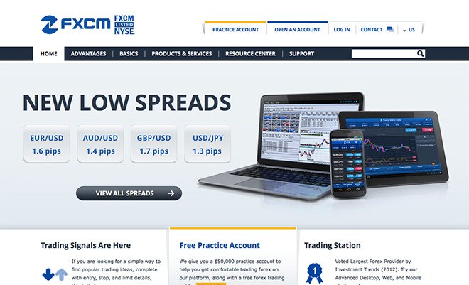
Original Homepage
On-page SEO was suboptimal and with a cursory review, it was clear that the site needed a simplified palette, intentional organization, and precise content to have a chance at impacting FXCM’s most important metrics.
I spent the next few weeks examining every inch of the site, scoring heuristics, documenting examples, and writing my review. The average score (1-5 scale) was 2.3 per each heuristic. I suggested the following as the primary issues to focus on in a redesign:
Prioritize content based on primary persona expectations and needs
Reorganize and rewrite the navigation to be shallow, narrow, and understandable
Be consistent with the language, form, and function of all UI elements
Increase signal through information hierarchy, in particular with essential CTA’s
Invest in making user’s lives easier
Provide both contextual and destination help
After a review with my client, I agreed to re-architect the site, provide specifications for an onboarding experience, and outline a content strategy.
Aim for the Prospect, Support the Client
The heuristic evaluation made clear that the site was attempting to speak to everyone, yet no one in particular. This scattershot approach was on full display in the navigation structure and nomenclature, the wide-ranging focus of educational pages, and across the various product descriptions.

Heuristic Evaluation
Quick. Dependable. Always great fodder on the way towards reaching alignment.
Since primary persona scenarios hadn’t been identified prior, the organization of the site and the content led users to meander about and subsequent content additions only added to the confusion. The same was happening with CTA’s and sectional additions — the target audience was only generally identified and design standards weren’t consistently followed.
What was communicated and how it was presented was confusing.
I didn’t have the budget to interview a breadth of potential or actual clients, so I sat down with my sponsor and the marketing team and walked through their understanding of:
Their existing site visitors and
What market was most valuable to attract and why
The conversation was grounded through FXCM’s market profiles, and after speaking to a few SME’s across the firm, we agreed on my approach to create “stake-in-the-ground” design personas — to synthesize their segment knowledge they had into human form, creating discernible edges around the expectations of human beings rather than fluid markets.
FWIW, people these days seem to think personas are useless, and I tend to agree if they have no grounding in reality. But if an archetype is derived from any real investigation into the motivational, behavioral, and aspirational patterns of people, even if the artifact only serves as a tool to drive alignment across teams, I find them to be invaluable.
In this case, they held space for us to align on human-centered design, architectural, and editorial decisions.


The expectations framed up within each persona gave precise direction to the editorial team as they published new articles on their content calendar while I designed a simplified Advantages container to house content speaking to the needs of seasoned forex traders not familiar with FXCM, and a Basics section for the traditional stock trader interested in understanding how forex works.
Simplified Taxonomy and a New Design Language
Once the team moved towards simplifying content by aiming it directly at our personas — speaking directly to potentials and existing clients in ways they would understand and find useful — I simplified the topical navigation, creating affordance towards key conversion paths.
I began on the landing page — a large percentage of traffic from keyword buys directed potentials to the front door — and worked my way through the key sections of the site. My primary concerns were to:
Establish clear paths for potential clients to track
Design an evergreen home for a sign-up call-to-action in the header
Design a first visit on-boarding experience for forex platform newbs
Design a hero section — real estate to bubble up events, seminars and educational videos.
Once I had a clear structure in mind, I presented a sketch of the information design framed with persona representation to marketing leadership, highlighting which section would speak to which user(s). We reached alignment rather quickly, and the exercise sold the final wireframe of the key templates across the site.
To reach higher conversion rates, we stressed the importance of keeping paths consistent across the same areas of the interface, particularly in the header and in the rail of content pages.


My wireframes assigned contrasting colors to emphasize to my visual designer the kind of affordance we needed to drive traffic to the practice account CTA across the site. We also aligned on clearly describing the details of a practice account above the fold on the homepage. This set clear expectations so that a potential client would have less reason to bounce out of their purchase cycle on-site in order to hunt down foundational information.
On content pages, we tackled the process for submitting practice account information by moving from a complicated wizard to a few fields in the content rail, with the hypothesis that such simplle, light authentication would reduce bounces. If we were right, our conversion numbers would jump.
And wow did they jump.
Business Impact
The redesign was highly impactful across the board. AJ Mihalic, Global Director of SEO, shares these business outcomes on his LinkedIn profile:
The project focused on improved UX, IA, and SEO, and it was so successful the changes were rolled out to the international domains:
- Improved account conversion by 3x for search, 1.5x overall, and achieved all-time sign-up highs
- Improved demo sign-up conversion rate by +42% for organic search, +20% overall
- Decreased bounce-rate by -20% overall
- Improved organic (SEO) visibility and achieved all-time high page-1 rankings on high value terms
- Achieved dominant market share on >1100 tracked non-brand keywords
New Brand Experience
The work was extremely satisfying. We established a streamlined & modern brand experience for a site with a wealth of content and simplified conversion paths which led to massive increases.